Beacon
Summary
The brief was straight-forward enough — to bring chat as a communication channel to the Help Scout platform via the existing embeddable widget, Beacon. The original Beacon (shown below) was designed as a super simple way to view help documentation within our customers’ websites — though never intended to extend to much more. So... add chat to the widget and call it a day. Right?

Since this small widget was going to be the gateway to chat and our future plans, I pushed for re-designing Beacon entirely using mobile-first principles. Aside from wanting a fresh start, early explorations revealed that my biggest challenge was going to be navigation — with so much functionality bundled into a small space, traditional desktop methods would have made this little tool feel heavy and hard to use.
Below — The original Beacon. Not awful, but very simple
Through lots of trial-and-error, user testing and big-boy tears I ended up using layering and depth to give the user a sense of structure without overloading the UI with navigation. I wrote about my design process here, and how that “ahah!’ moment struck whilst on date-night with my wife (sorry Sam).


Stacking content was a really effective way of containing lots of functionality, however animation emerged as a really important method of providing the visitor with a sense of direction. Without animation, it was difficult to know where you came from, and how to get back. So, prototyping was key for this project — as was communicating animation’s importance to the engineers.
Designing a Personality Direct link
Another key realization was the importance of UI details and micro-interactions to give each Beacon a fun and friendly personality, whilst also remaining unique to the brands and websites that were hosting the widget. As each Beacon could be branded and translated, personality came in the form of subtle animation and fun, unusual and sometimes-a-bit-weird interactions.
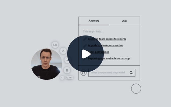
Eventually Beacon scaled to a being a fully-featured docs and chat app that’s used daily by thousands of customers and their visitors to educate and communicate. During the design and build phases, I also created a component library based off our design system to help keep things consistent.

As an additional challenge, every screen of Beacon can be translated and themed to match a customer’s brand…
Onboarding Direct link
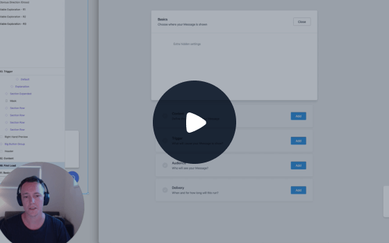
Whilst complex and powerful in nature, I didn’t want Beacon or the Chat Admin to feel overwhelmingly complicated or technical to create — so close attention was paid to designing an onboarding flow that felt lightweight, yet powerful. Ultimately Beacon isn’t much use if no-one is creating them!

Customers are able to customize colors, icons, translate every bit of text, even decide how prominent they want chat or self-service to be. It’s safe to say that settings play a bit part of the overall experience.